02 Nov AKQYS Case Study
AKQYS is a tech. company that is developing multiple physical and digital products. The products AKQYS is working on will enhance the consumer’s travel experience.
My client wanted a logo that would translate as timeless, chic and diverse. It needed to work on multiple mediums (print, digital and 3D.) Most importantly the design needed to fit the companies future growth expectations.
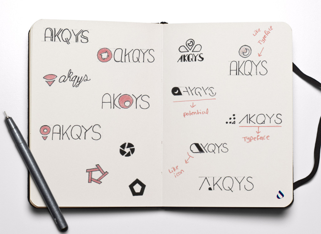
Initial Sketches
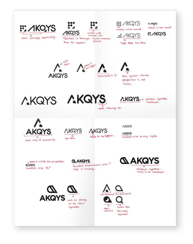
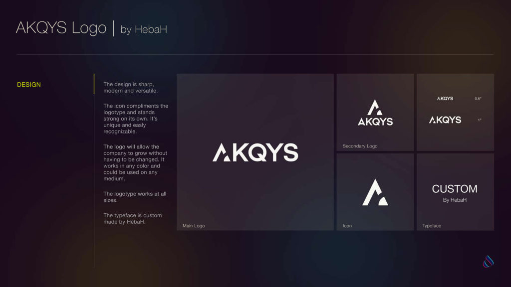
The biggest challenge designing the AKQYS logo was developing a unique but diverse logotype. The Icon needed to compliments the logotype but it needed to be strong on its own as well.
Digital Sketches
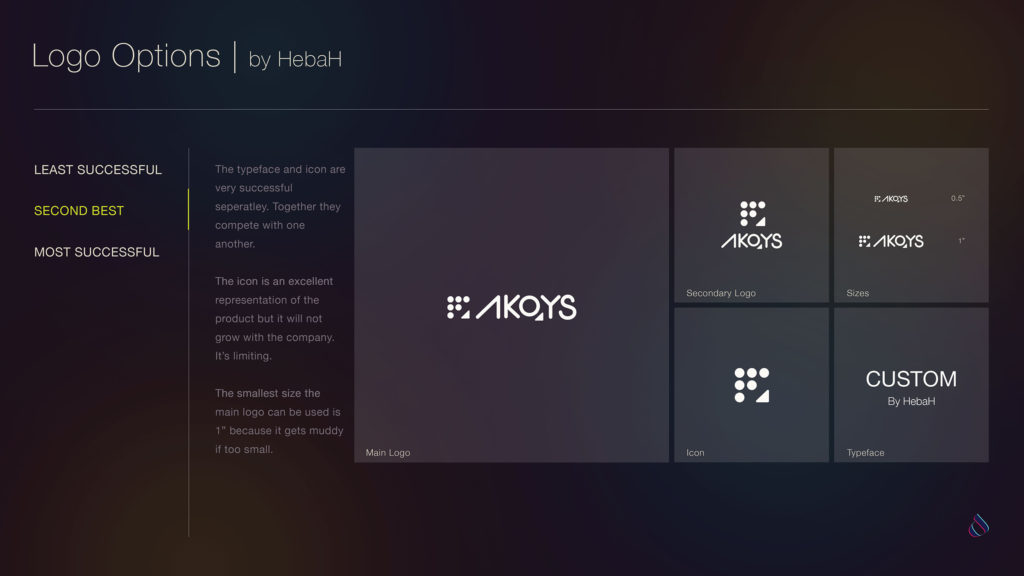
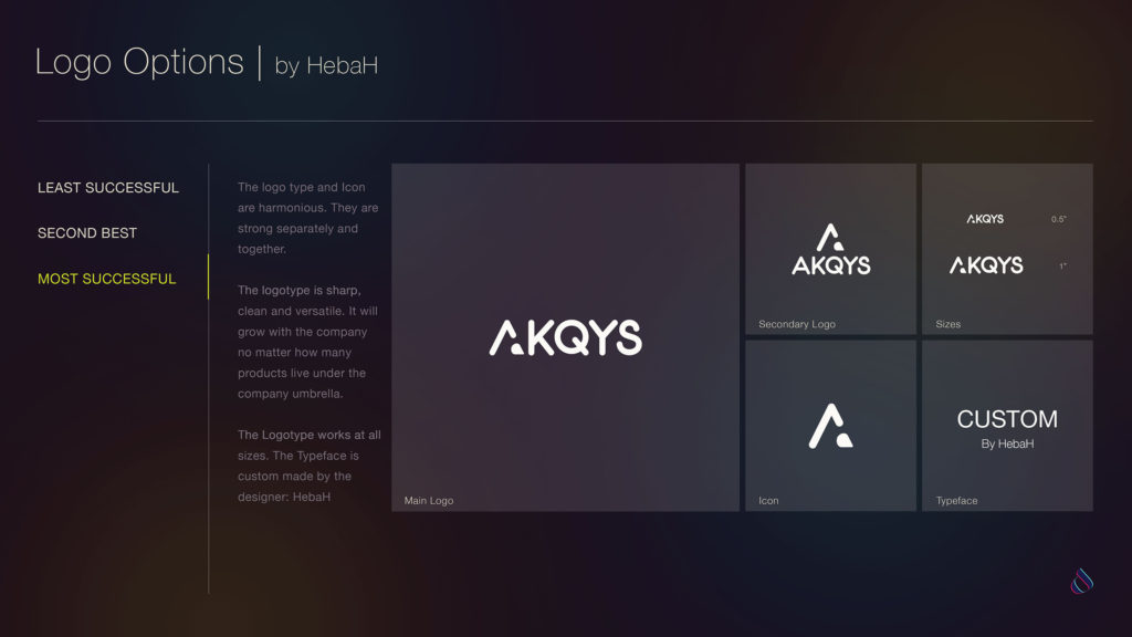
Submissions
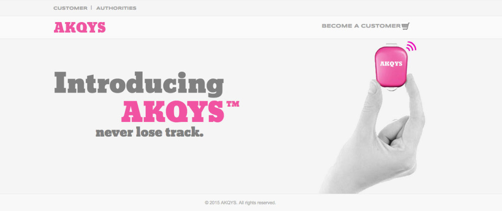
Old Website
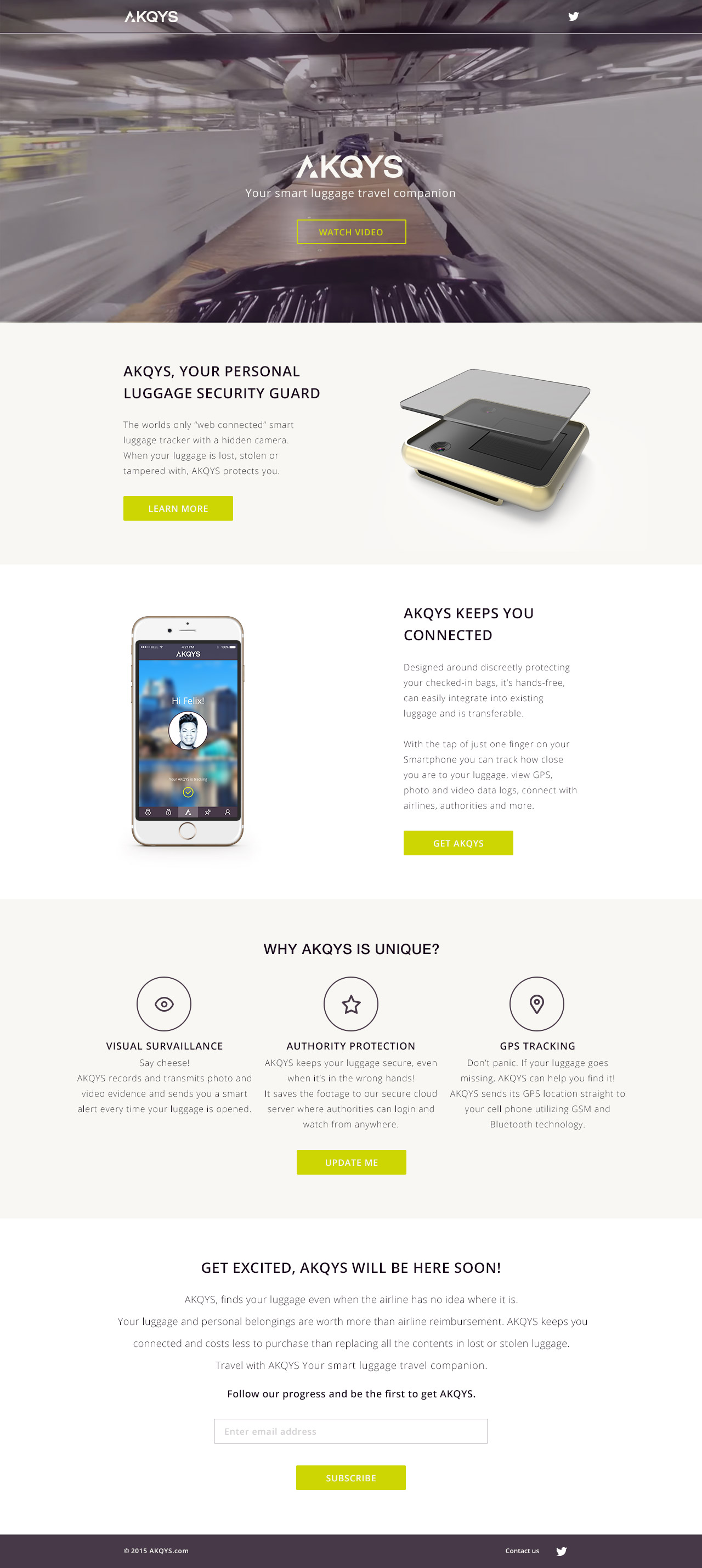
The website redesign focused on the user’s experience as they learned about AKQYS and their current products.
New Website



No Comments