07 Dec DIY.FUND Case Study
DIY.FUND provides do-it-yourself investment tools for the individual investor. They removed the middleman, allowing investors to take charge of their own investments.
My client wanted a design that would convey honesty and community. The logo and website needed to be redesigned to portray a balance between the confidence of corporate and the user friendliness of DIY.
logo should convey that you can manage your own fund with our professional grade platform that is easy to use.
Logo

Before
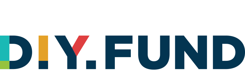
After
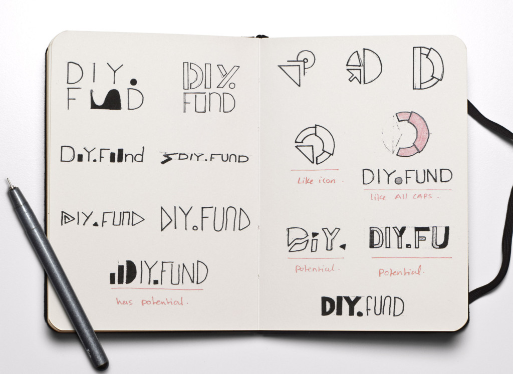
Initial Sketches
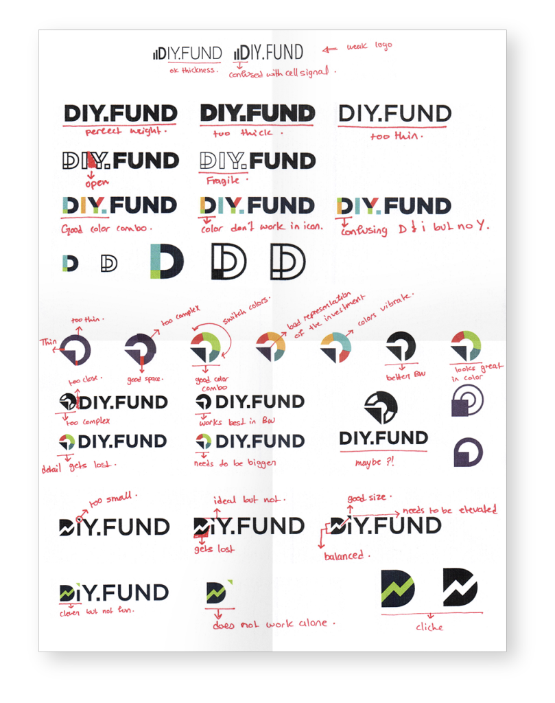
The biggest challenge designing the DIY.FUND logo was having to keep the name identifiable as a website. Another challenge was designing a logo that would represent the serious nature of the product without jeopardizing the companies do-it-yourself ideology.
Digital Sketches
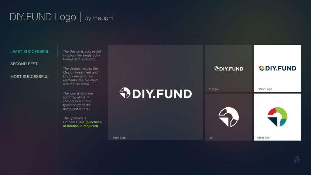
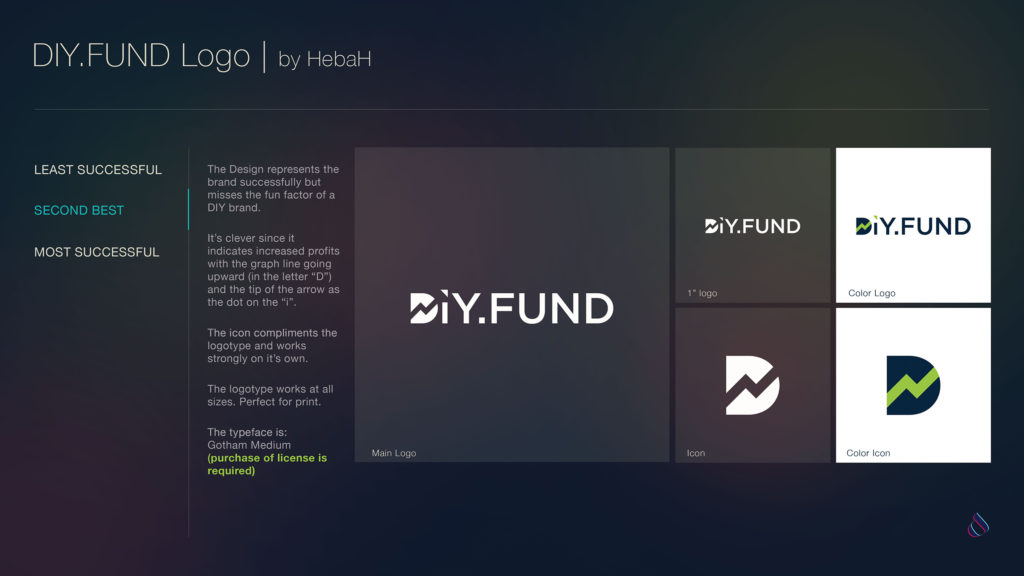
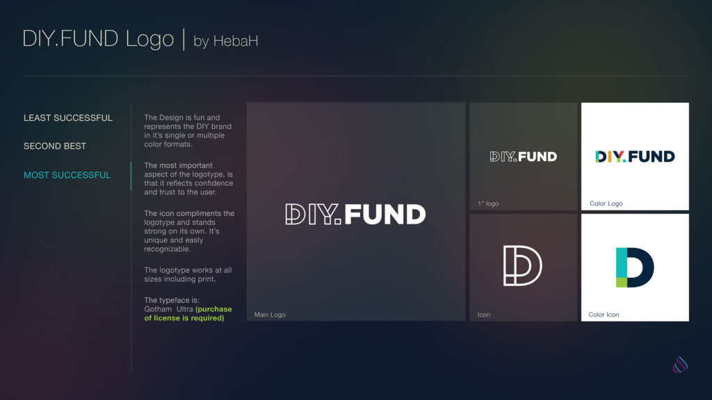
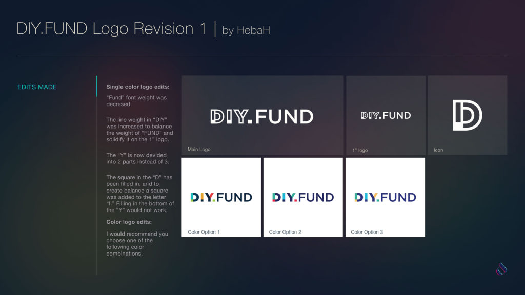
Submissions
Website
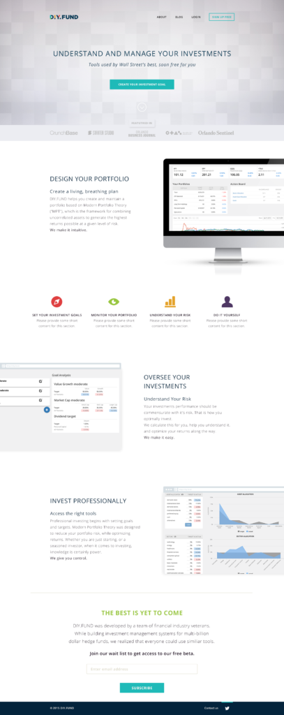
The website redesign focused on the user experience. It needed to be clean and to the point. Allowing the user to see the value of the product and make it easy for them to sign up and start managing their own investment.
We want people to have a comfort that when they sign up for an account, they trust that we are a well thought out, and trustable solution. We want it to convey that we are not providing tools that are dumbed down, but are simplified so that anyone can use them.
Since the relaunch, the conversion rates have been increasing. The product design portion of the project is ongoing.
-
New Website
-
Old Website



No Comments